Vialto Partners
Year
2022
Duration
3 Months
Services
Art Direction
Brand Strategy
Brand Identity
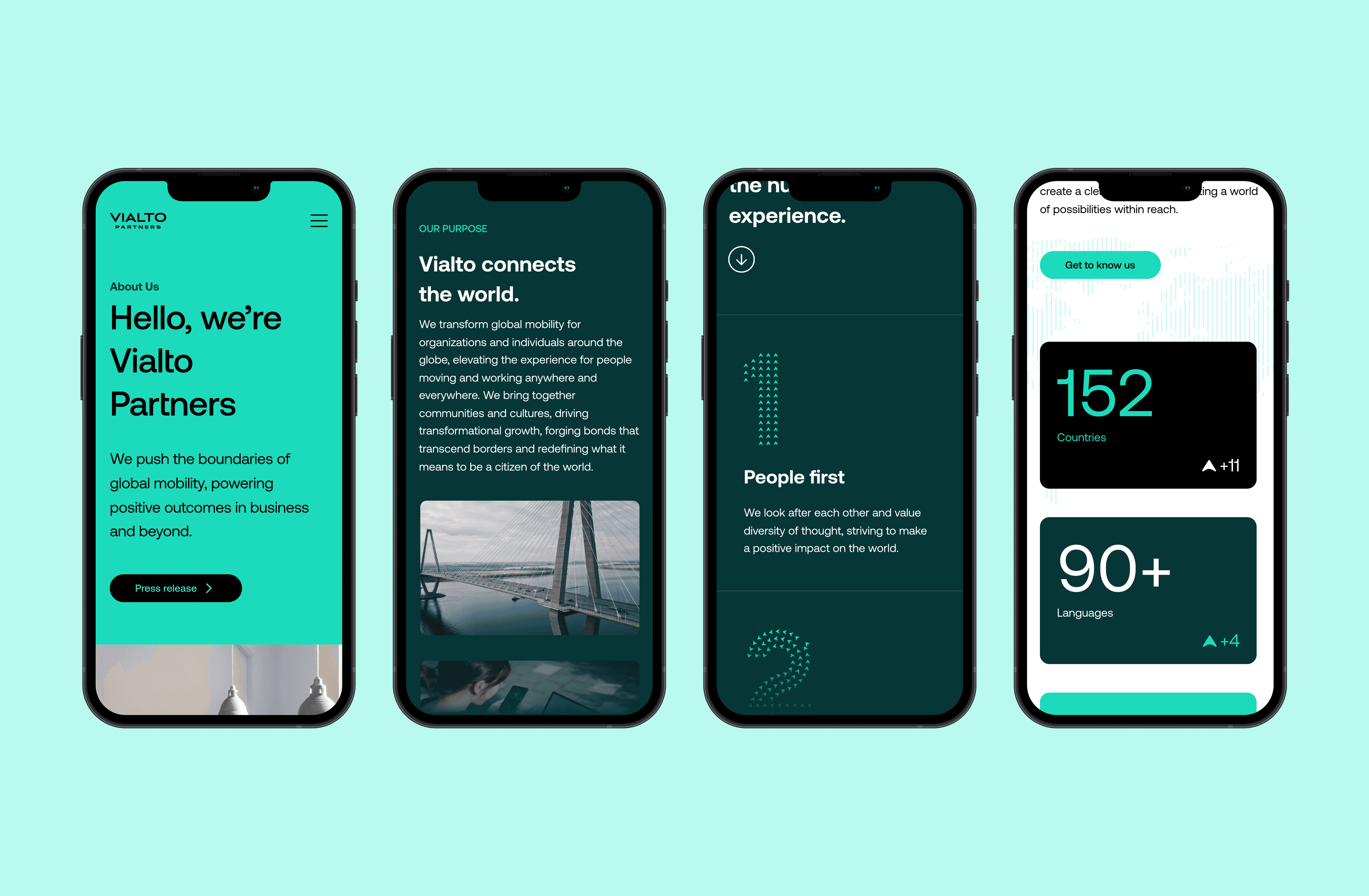
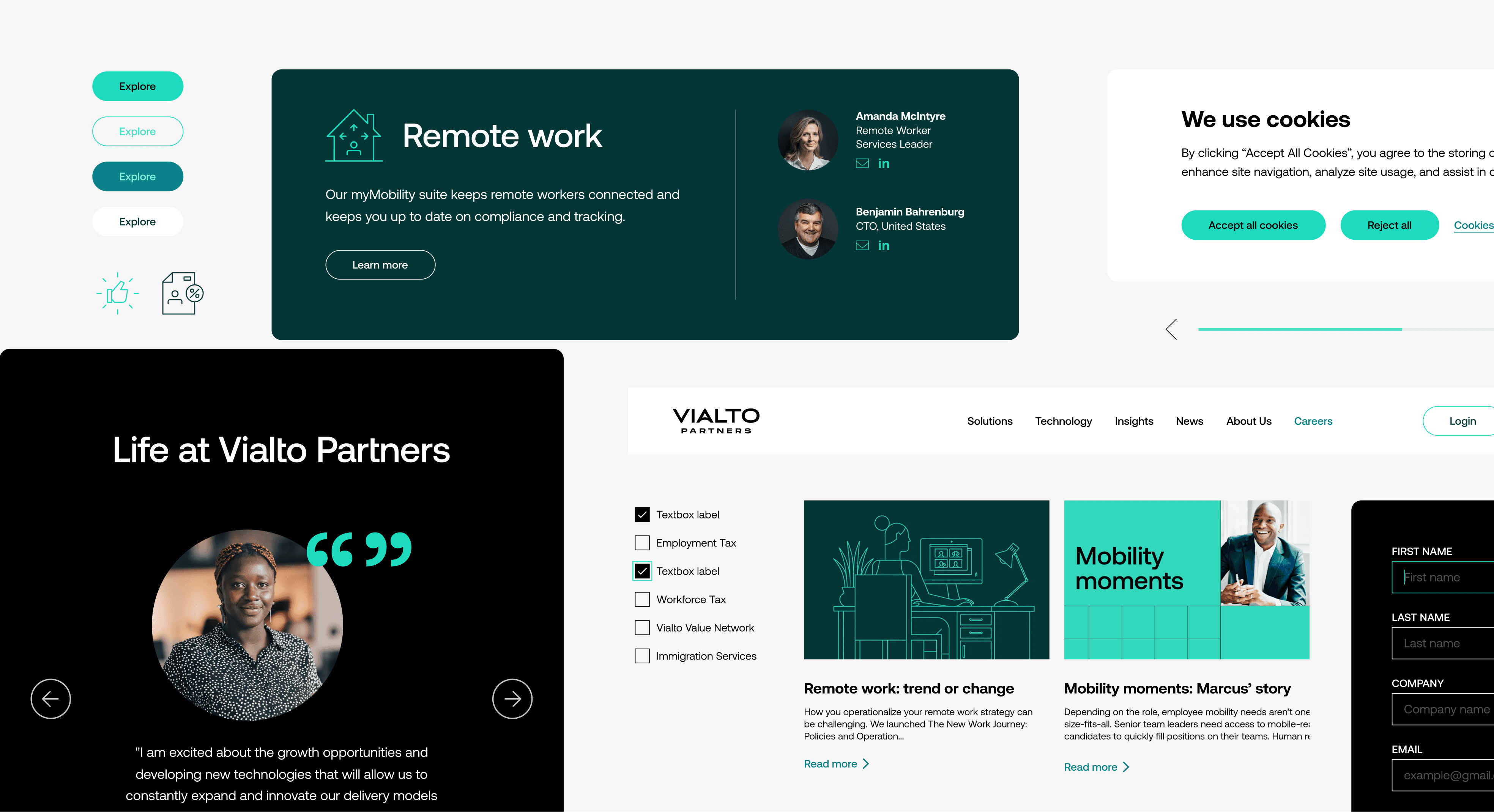
Web Design
Motion
Team
Prophet
Craig Stout (Senior Partner)
Vansuka Chindavijak(Art Director)
Julie Cho (Designer)
Vanessa Turner (Designer)
Prophet Web Design Team
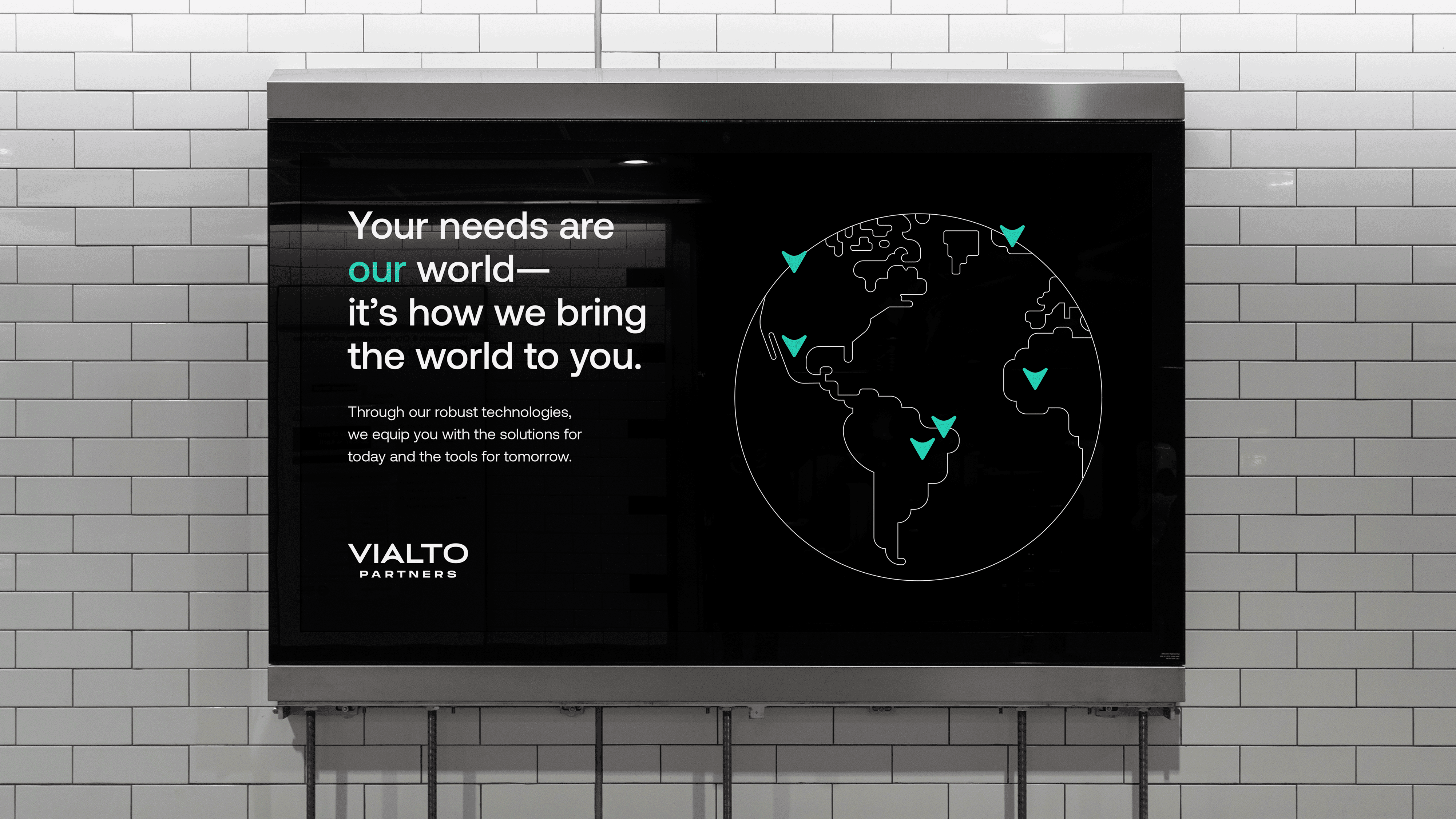
Vialto Partners, a company focused on moving people and handling taxes and immigration worldwide, recently became independent from PwC's similar division. They wanted a new brand identity and name to highlight their role as top players in the mobility field. Their goal was to keep the trust and reputation they had from PwC while distinguishing themselves as the future-forward leader different from their competitor brands.
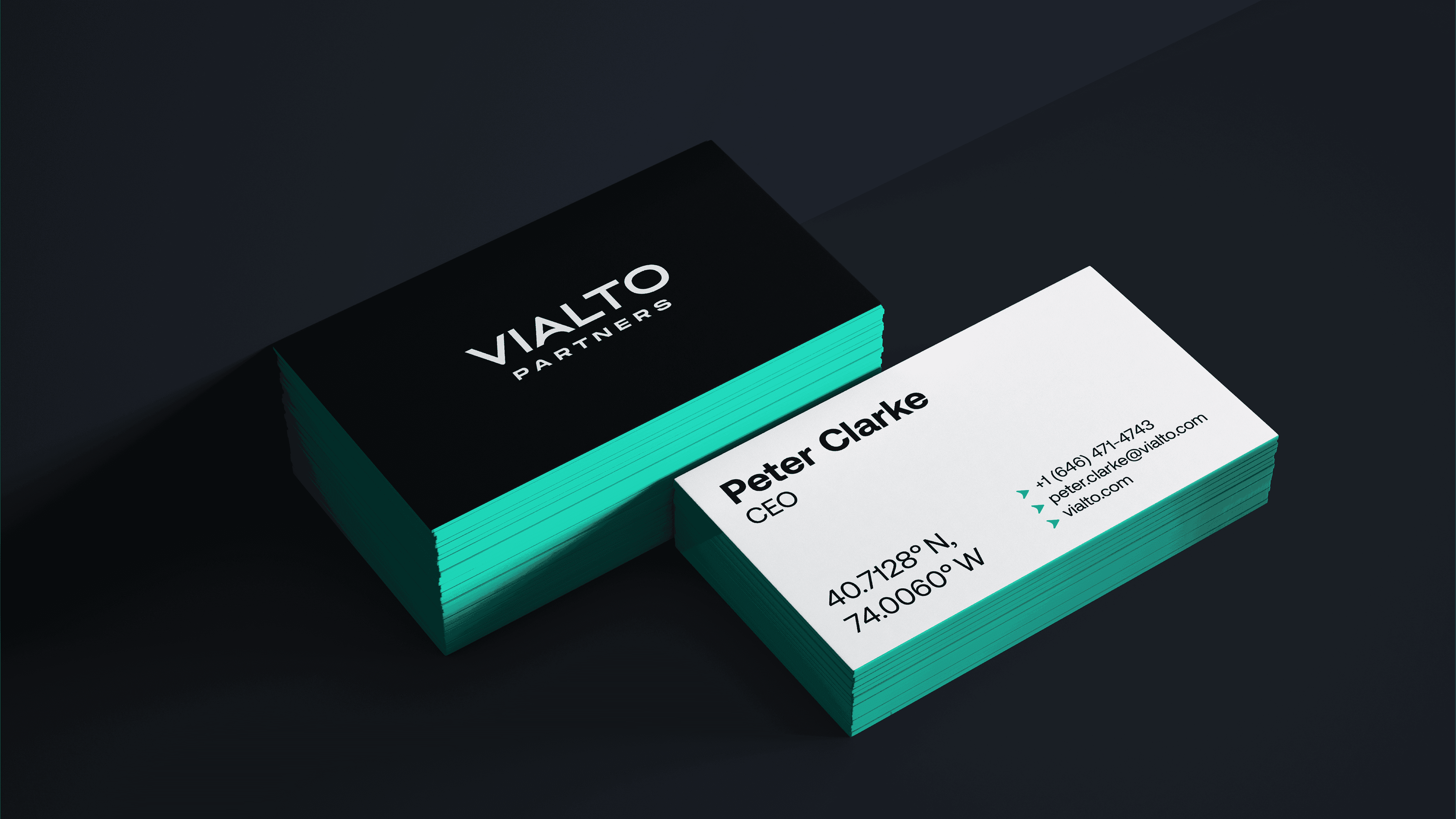
Logo and Symbol
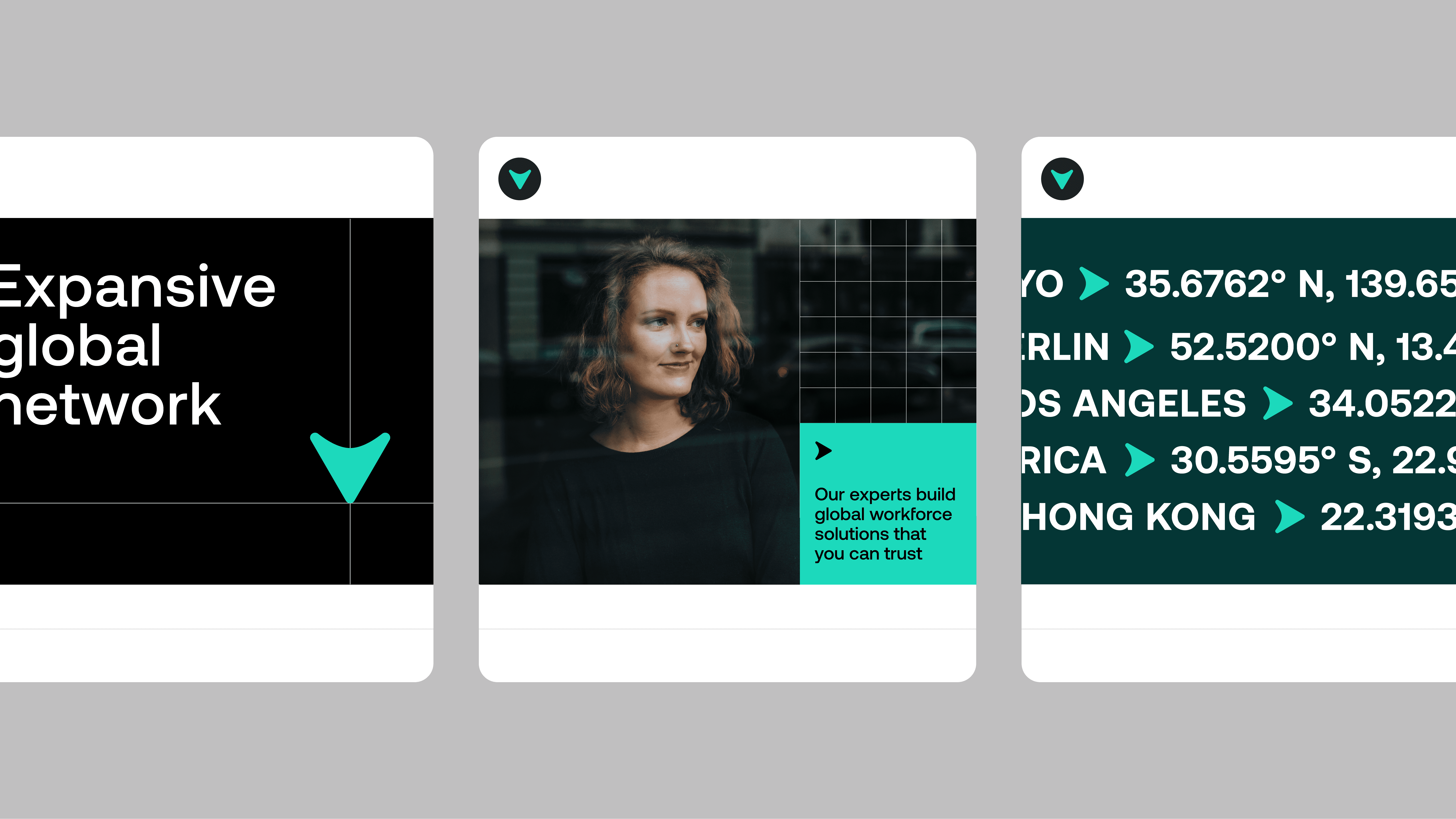
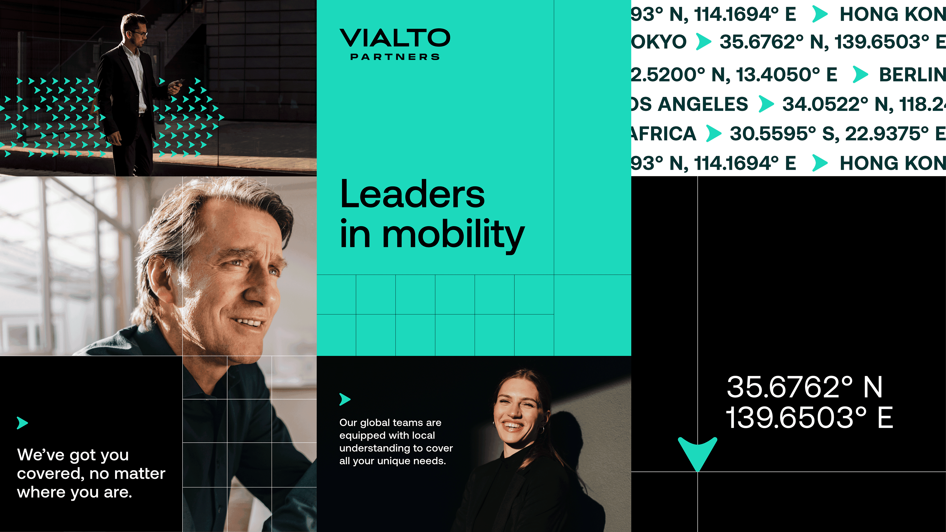
The name ‘Vialto’ was inspired by the name of the oldest bridge in Italy, which connects to the Company’s decades of experience in its field. We thought the name could build a strong following as a brand and created a symbol, ‘Vixel’, as the central graphic element. ‘Vixel’ represents the overarching idea of leading people to their destinations and bringing the value of the company forward. ‘Vixel’ is linked to the letter ‘V’ in the wordmark, which is reflected in the visual system via patterns, pictograms and illustrations.

Color and Visual Concept
The core color of the brand is teal with different shades to play with infographics and layouts expressed in a modern way. The graphic layout is inspired by longitude and latitude lines and grids that allude to the Company’s global travel and mobility service offering. The intersection of the two lines moves on the board to create flexible layouts.